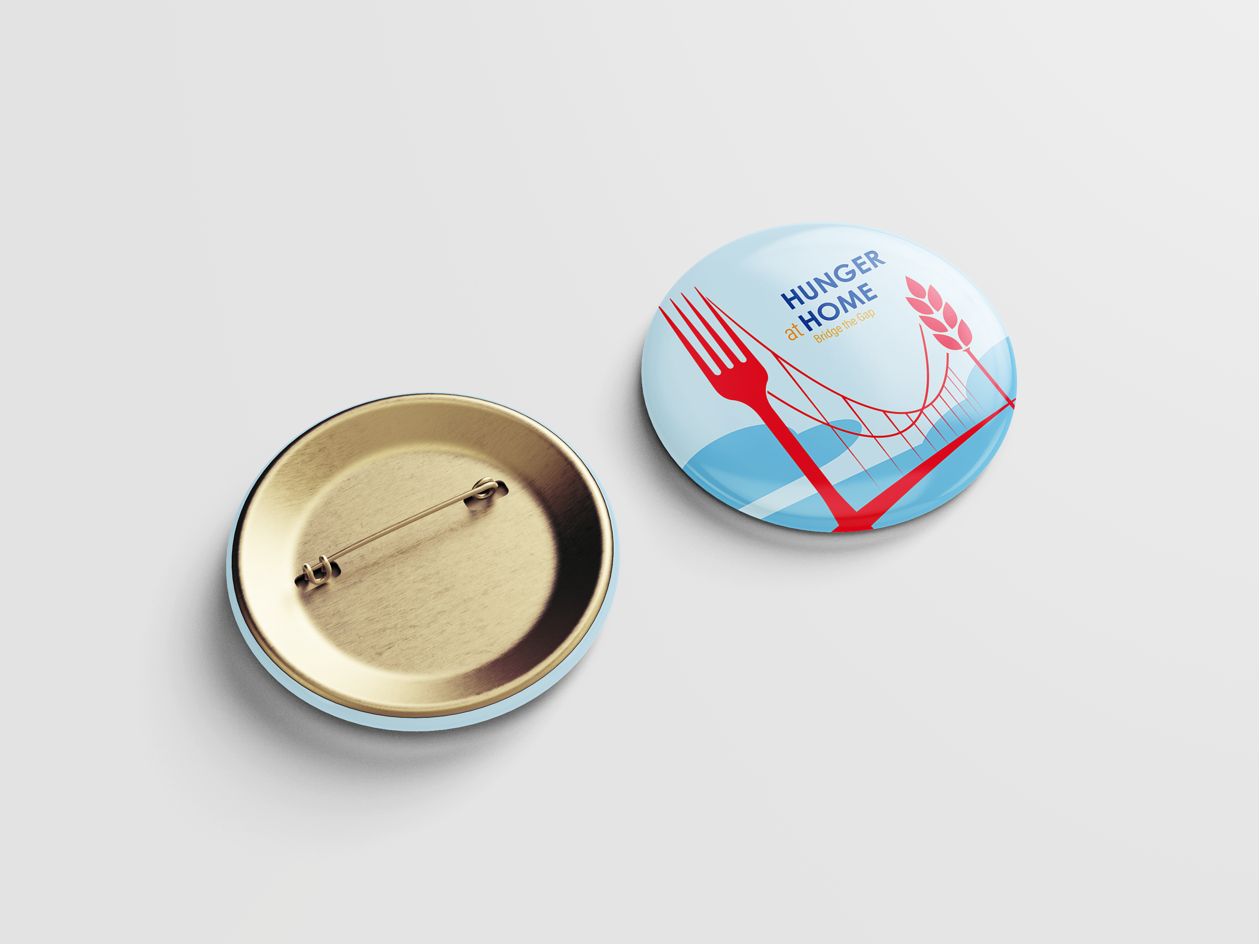
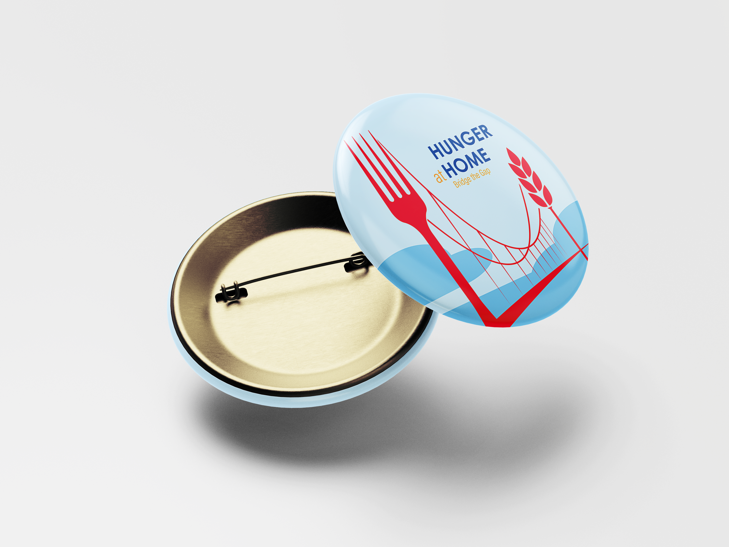
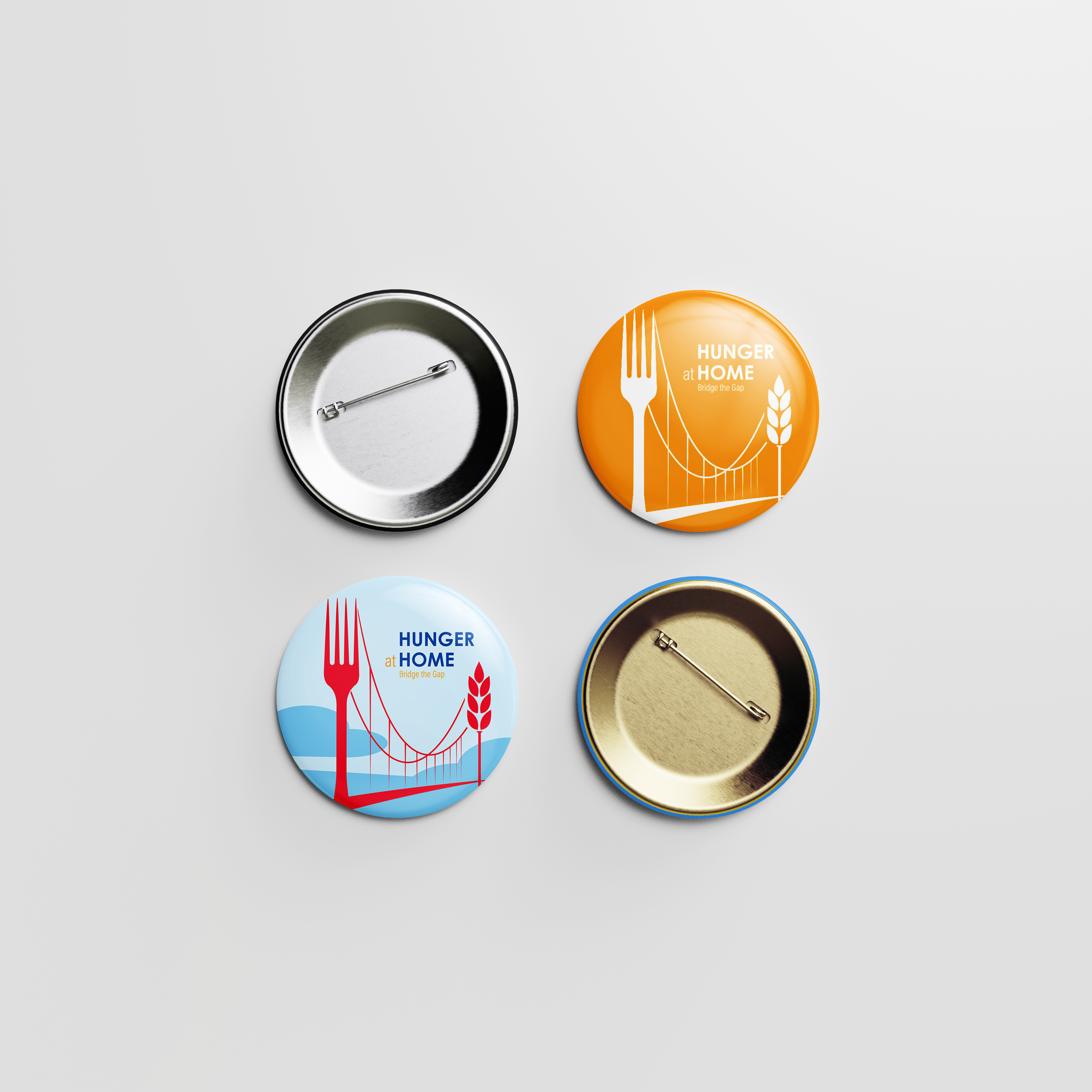
We started by redesigning their logo to something that more effectively communicates who they are as an organization. The main goals of the redesign was to clearly communicate the goals of the organization, make it clear they are a nonprofit group, and maintain the iconography and symbolism from the original showing they are local to the bay area, and committed to “bridge the gap” in food disparity


How to create a fundraising campaign?
Our team thought creating buttons was an easy first step to raising brand awareness with the new logo, and offer them to those who donate directly to Hunger at Home. We thought that partnering with local businesses would be a good way to raise funds, setting up collection tins, and posters outlining how many people a donation could help to feed.

